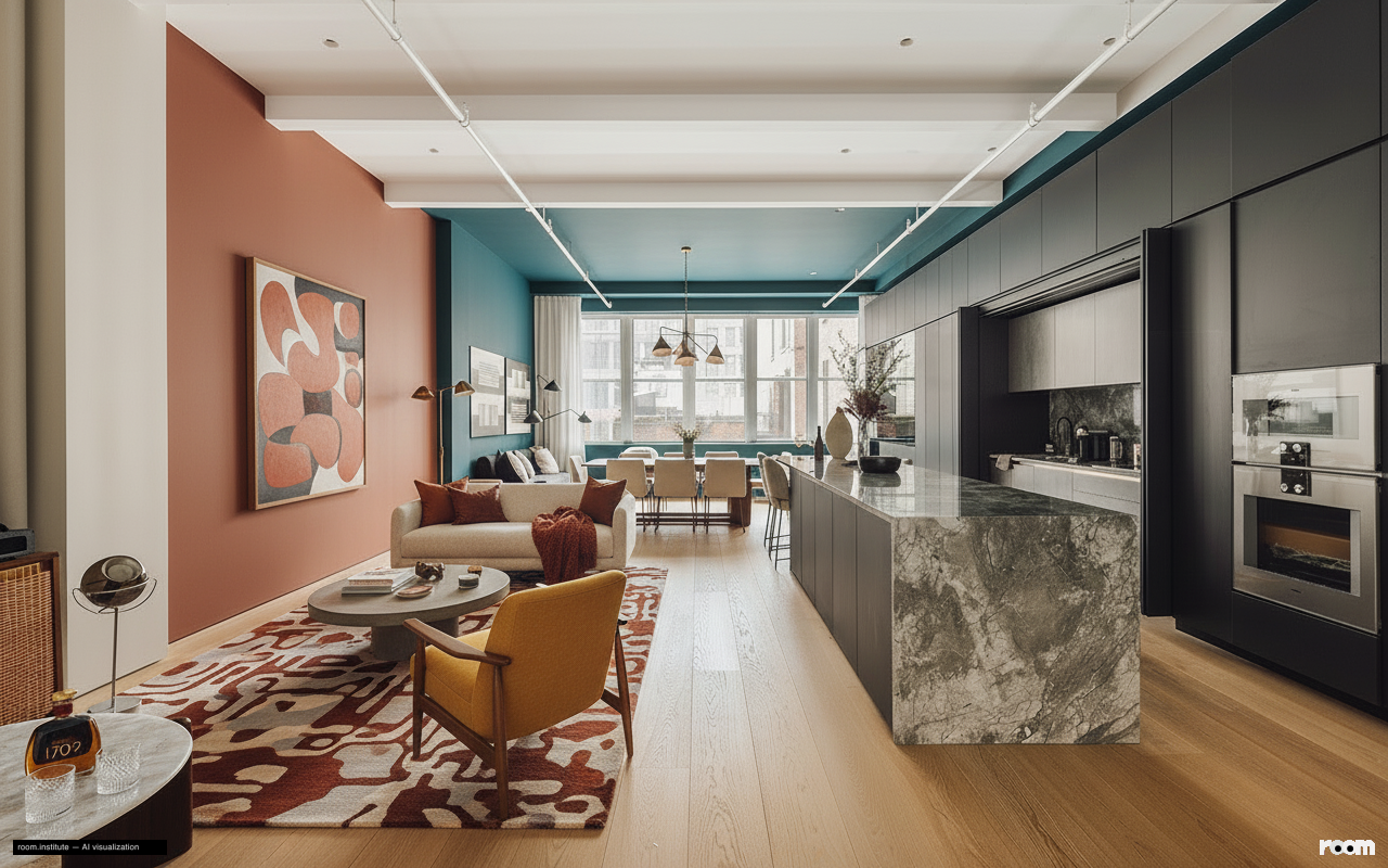
Color directs perception throughout this open loft. The dining area's deep teal walls and ceiling clearly define its purpose. Kitchen cabinetry uses a two-tone scheme to explain storage roles.
A terracotta accent wall in the living zone justifies its hue by interacting directly with a large art piece. Pearlized floor sections literally reflect paths of movement, guiding circulation.
Every color choice in this room serves a clear function.
Design Philosophy
This design applies Zoned Color and Justified Tones to every surface. Each color choice serves a specific functional or visual purpose. Color delineates zones, explains storage, and highlights art. The space uses color as a structural element, not just an aesthetic layer.
Spatial Narrative
The eye immediately sees the dining area's deep teal enclosure. Movement then leads past the two-toned kitchen cabinetry. You end in the living zone, grounded by the large art piece and its vibrant wall.
Light Study
Morning light streams in, brightening the pearlized floor paths and the lighter kitchen uppers. Evening light softens, deepening the teal dining area and intensifying the terracotta living wall. It creates distinct moods across the day.
Living Vignette
A hand reaches for a book from a clearly designated, color-blocked shelf. The matte cover feels cool against the warm, abstract painting on the adjacent wall.
Material Palette
Matte finish paint: It feels soft to the touch, absorbing light; its non-reflective nature maintains color depth over time.
Pearlized wood floor finish: This finish adds a subtle sheen, reflecting light to brighten pathways; it resists wear while highlighting movement.
Natural wool fabrics: Wool feels soft and durable, offering comfort; it ages gracefully, maintaining texture and warmth.
Honed black granite: It feels smooth and cool, offering a subtle matte look; granite endures heavy use, developing a rich patina.