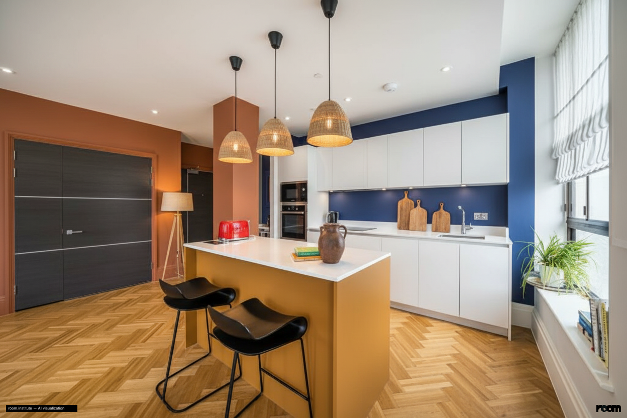
The main kitchen wall receives a deep indigo drench. The island and adjacent pillar now feature vibrant ochre. A terracotta accent marks the room's entry point. Each color defines a specific activity zone.
Matte materials support focused tasks in the indigo area. Polished surfaces invite engagement at the ochre island. Cooler task lighting illuminates the main counter. Warmer ambient pendants glow above the island.
This kitchen guides focused work and lively interaction.
Design Philosophy
Color drenching saturates distinct areas with single hues. Tonal blocking separates these zones visually and functionally. This system guides users through focused culinary tasks and vibrant social interactions. Materials and lighting reinforce each zone's intended purpose.
Spatial Narrative
The eye first moves to the deep indigo task wall. Movement flows naturally towards the vibrant ochre island. Here, guests gather for conversation and dining.
Light Study
Morning light highlights the warm ochre surfaces. Evening brings precise task lighting to the indigo zone. Warmer pendants above the island create a soft glow for social evenings.
Living Vignette
A chef measures spices under crisp, focused light. Guests lean against the ochre island, drinks in hand, sharing stories.
Material Palette
Matte finish paint: It feels smooth and absorbs light, maintaining deep color saturation over time.
Honed black granite: It offers a non-reflective surface, hiding smudges well and aging with a subtle patina.
Polished white quartz: Its reflective surface feels cool and stays bright, resisting stains and retaining its sheen.